Were you aware that the design of your website accounts for around 70% of its credibility? If there are multiple errors in the design, audiences may distinguish your company as less trustworthy. To make sure your business stands out online in a positive way, whether you’re creating a new website or updating your existing one, it’s important to avoid these mistakes in website development in Dubai.
This article features some prevalent website design mistakes that most new businesses do while creating their first website. Additionally, it provides practical solutions to rectify or prevent these mistakes from occurring.
The most significant website design mistake is failing to prioritize user-friendliness. Treating accessibility as a secondary factor can lead to four primary mistakes, which include insufficient color contrast, missing or inappropriate alternative text for images or graphics, inadequate or missing visual focus indicators, and overlooking accessible names or labels. Experts find out four main errors that may be related to accessibility:

By the second quarter of 2022, mobile devices accounted for more than 50% of the worldwide website traffic, and this figure does not even cover tablet devices. If your portal is not as user-friendly to navigate the content on mobile devices as it is on desktop computers, you may annoy your visitors and increase your bounce rate.
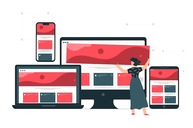
Nowadays, users access websites from various devices such as phones, tablets, laptops, or even TVs. Therefore, if your website is not optimized for all these devices, visitors may lose confidence and leave your site.
A website development company in Dubai usually builds websites using desktop web browser tools. However, a common error is to assume that your audiences will view the website on desktop only.
In recent years, a common error in website design has been to emphasize appearance over usability. As the field of design has expanded rapidly, there is now a pressure to excel in order to achieve success. However, this has resulted in an overuse of graphics and design elements that may engage users visually but do not necessarily serve the website’s intended function.

As you wander through the city center, you come across a clothing store with a captivating and imaginative window display that showcases a range of clothes on sale. With an appealing backdrop and catchy taglines, it tells a story that captures your attention.
On the other hand, you pass by another store with only a few clothing items on mannequins in the window, failing to catch your interest.
Your website serves as your digital shopfront, representing your business and brand. To make it stand out, it must have a unique and personalized design that reflects your company’s identity. Opting for a generic template without customization in ecommerce website development in Dubai is a risky design mistake that you should avoid.
Have you ever come across a website that left you confused? This typically occurs when a website lacks a clear hierarchy. To avoid this, it’s essential to use typography in your website design effectively. Similar to how a news portal uses headlines and subheads to convey importance, your website’s typography should also signify information in the same way.
Addressing this problem is not easy particularly when you have wide-ranging audiences with dissimilar preferences. However, it would be good to collaborate with the best ecommerce website design company in Dubai to give your website a cohesive structure.

Unclear navigation on your website can create a frustrating experience for visitors, which is why having clear navigation is crucial. As more businesses move towards a digital presence, website content can become cluttered and convoluted.
Ensuring consistent and clear navigation across multiple touchpoints and user journeys will help visitors seamlessly conversion from first-time visitors to loyal audiences. The best web development company uses the latest tools and features to make a website easy to navigate.
Upon landing on your website, people should be able to easily understand the nature of your company’s operations. Your website must strengthen the credibility of your business by communicating its purpose and reassuring visitors that they have arrived at the right place. If it fails to do so, a website redesign or redevelopment from experienced professionals is necessary.
Merely because numerous websites have a specific design or layout, it doesn’t necessarily mean that yours should adopt the same approach. Do deliberate and purposeful consideration to determining what should be included in your website.
Asking yourself some relevant questions about your objectives for the portal can help determine the most suitable approach. For example, consider whether the imagery serves a purpose or is purely decorative; whether the layout encourages users to read or take action; and whether there is something intriguing that may capture their attention for a brief period.
Having intuitive navigation is another important thing that should be put to the fore while developing your website. Having intuitive navigation is essential for creating a seamless user experience that facilitates easy information discovery and allows users to return to specific points on their journey. To make it possible, the developers must establish the navigation levels (preferably no more than three) and the manner in which pages on different levels connect back to their parent level.
Designing and developing a website requires a collaborative effort and a circular approach to make sure that teams, participants, and user knowledge are aligned appropriately. Find a website development company in Dubai to ensure that your website is built keeping your business goals and audiences’ interest in mind.
Also Read:
The Future of Logo Designing and Artificial Intelligence (AI) – Explained
How Metaverse is Redefining Ecommerce Mobile App Experiences
Is Your Website AI Ready to Outpace Your Peers?
BACK TO BLOGlet's make something great together